10 Designs · 2 Likes
DESIGNED WITH
Homestyler Floor Planner for Web
Dream Home
Welcome to this home! This home is just a one story home. It is about 3000 Sq. ft. There are 3 bedrooms, 2 bathrooms, 1 laundry room, 1 kitchen (open concept) and 1 living room (open concept). My theme for this home was modern as I love how modern architecture is simple and clean. Also, it just complements the structure as a whole. Not only that, I'm Asian so I thought that I just also include my background in this design. Most importantly, black is one of my favourite colours so I wanted to make a home that brings two ideas and makes it as one.

Floor Plan 260.84㎡

I didn't know how to start of my floor plan. I decided to look up Homestyler floor plans and I came across one that was organized very neatly and looked appealing to look at. I decided that I wanted my floor plan just like that one but I did make some changes. (Credit to the persons OG design).
web
Space Showcase 40 Renders
Bedroom 3
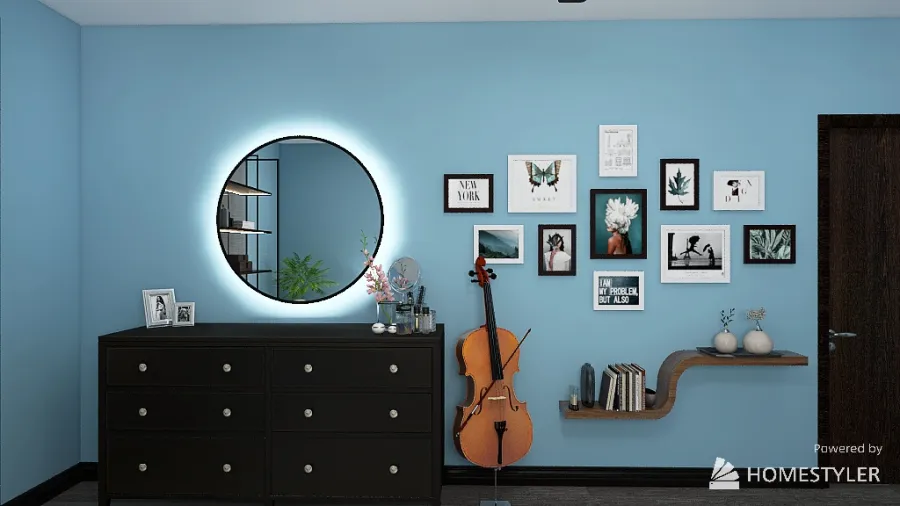
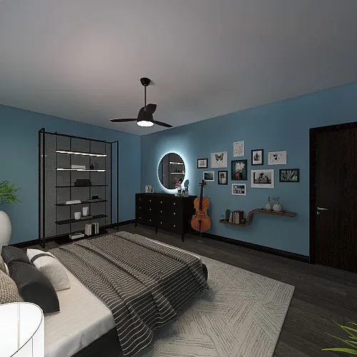
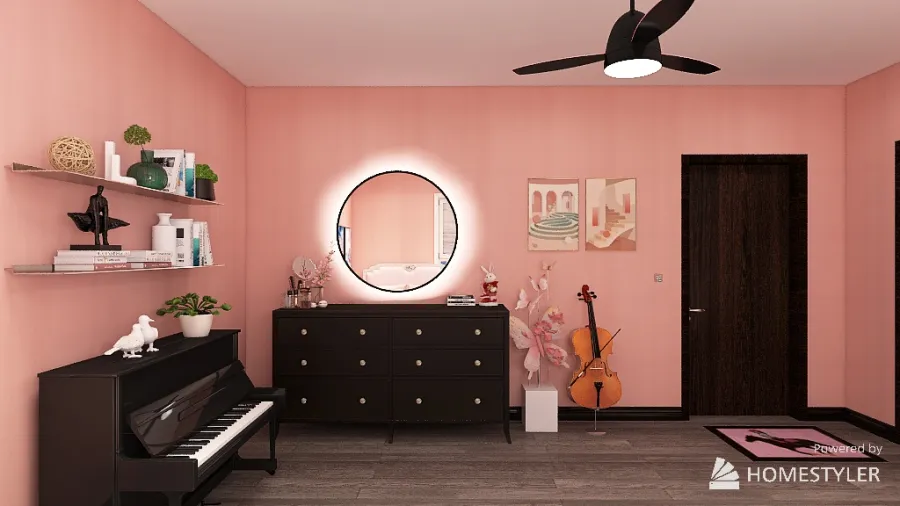
The idea behind this image was to put the mirror and dresser on the wall side and have a beautiful pic-collage and shelf. I decided to add a cello because I used to play one. My favourite part of this picture is everything. I just love the design layout and how appealing it is to look at.
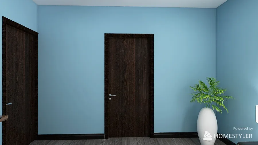
This is the door that leads to the bathroom. It's a connecting bathroom. There's also another door in the other bedroom to lead to the bathroom.
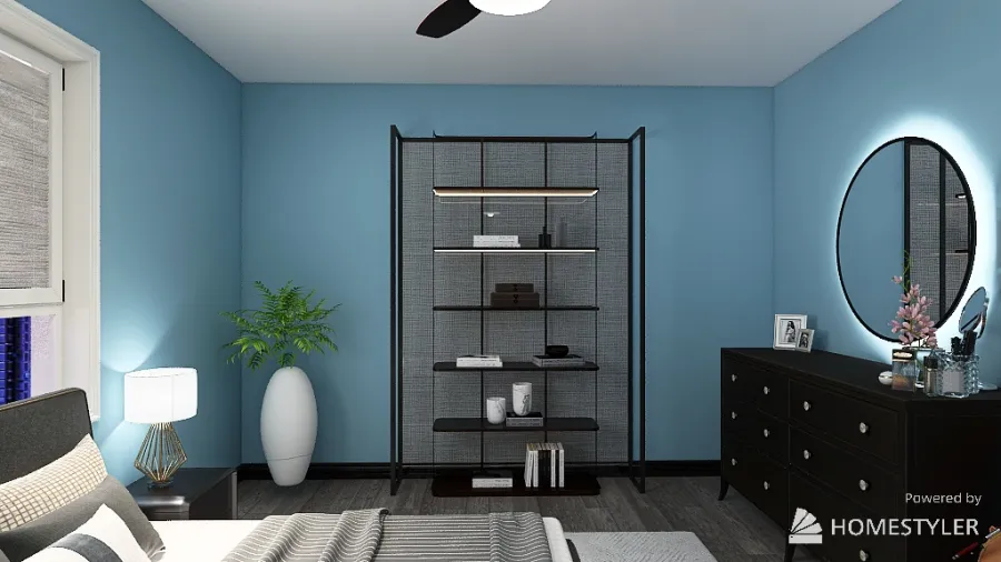
I wanted this side of the room to have a shelf that looked modern and fitted the theme of this room. I love how it looks because it fits the modern theme and it fitted the style of the room. Additionally, I like that the shelf just stands out on it's own without any other factors interfering.
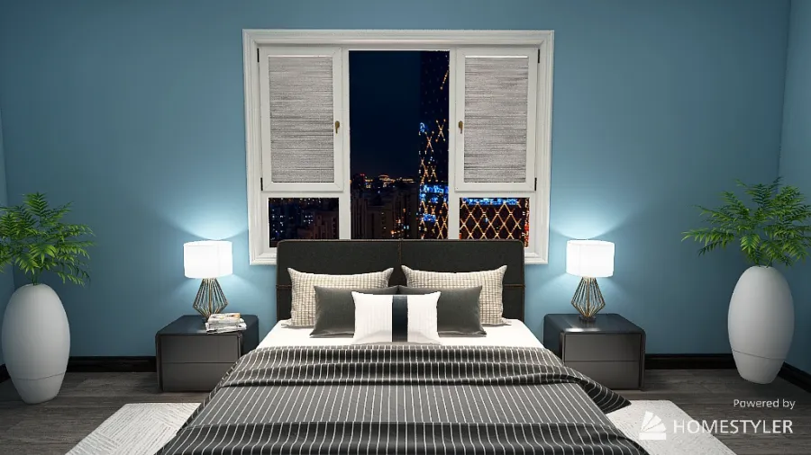
I wanted the bed area to look symmetrical. I added two nightstands and lamps, including plants. I love how there isn't much going in this area and it looks peaceful. Not only that, I love how the lamps complement the black and grey so that it doesn't look bland. I decided to add some greenery too.
720°
Panorama view. I'm sorry that it's blurry.
Closet
This closet is part of Bedroom 2. More information will be available in the Bedroom 2 section. Sorry for the inconvenience.
This closet is part of Bedroom 2. More information will be available in the Bedroom 2 section. Sorry for the inconvenience.
Bathroom 2
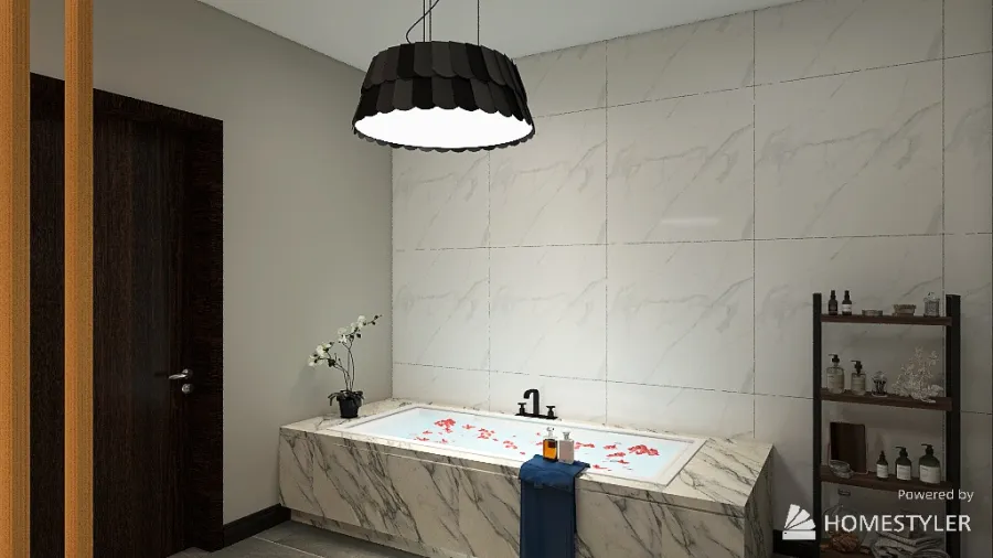
This is technically the Master Bathroom of the home. I decided to add white marble tiles for the back wall of the bath as most homes have that. Also, I liked how the bathtub was designed, especially since the rose petals and plant were there. I added a shelf for the hygiene care products.
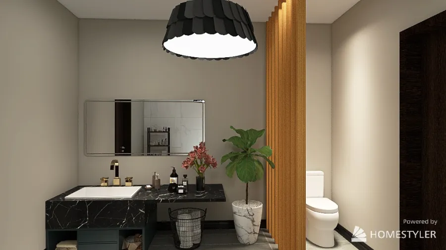
This is my favourite part of the entire bathroom. I loves how there is a bamboo "wall" that separates the sink and the toilet. Also, it looks so modern and appealing to look at in my opinion. I also like that the plant complements the bamboo "wall" as we tend to see them together in the real world.
Bathroom 1
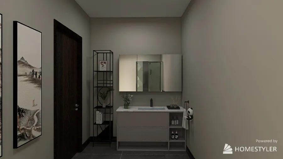
This is the bathroom for Bedroom 1. I wanted the bathroom to not be too childish; I just wanted the theme to fit with the rest of the house. I like how simple and elegant it looks. I also included a cute panda as I find pandas adorable.
I didn't want this wall to be plan and boring so I decided to add this painting.
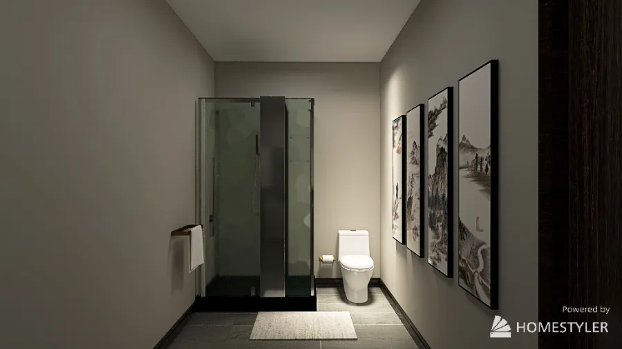
I just kept this side simple as most homes don't have much going on in the shower area. I chose to put the shower here instead of the front because it would be weird to see the shower right beside the door. Additionally, I like how the lights shines in the toilet area and gives off some light.
Bedroom 2
This is another view of the room. There is a walk in closet. I chose to have a walk in closet because I didn't want three doors in this room as there's already one to enter, and one for the bathroom. I also love how there's enough space to walk around and doesn't make the room look clustering.
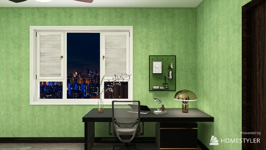
This side of the room has a desk as I feel that it's necessary. I didn't add too much to this side since the bed side has beautiful paintings. I wanted this side to look simple and less clustered. I love that the desk is near the window because it looks better and pretty.
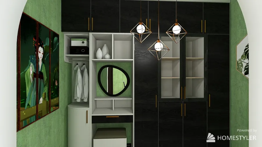
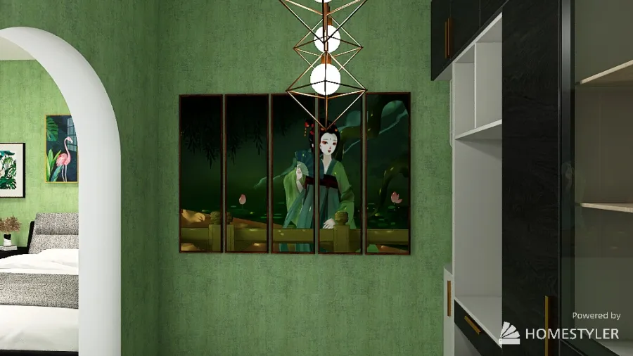
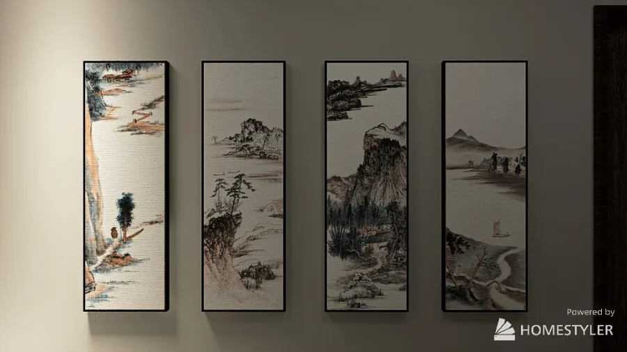
This is the walk in closet. I wanted the wardrobe to be black and white. (Still stayed with the modern theme here). I also added paintings. The painting on the left looked pleasing to look at so I added it here in the closet. It's also part of the Asian culture so that's also a reason I added it.
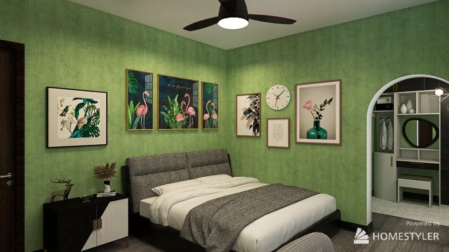
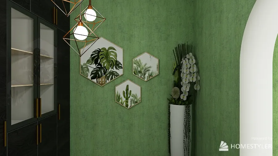
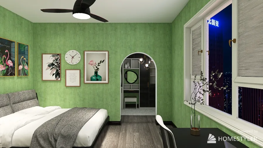
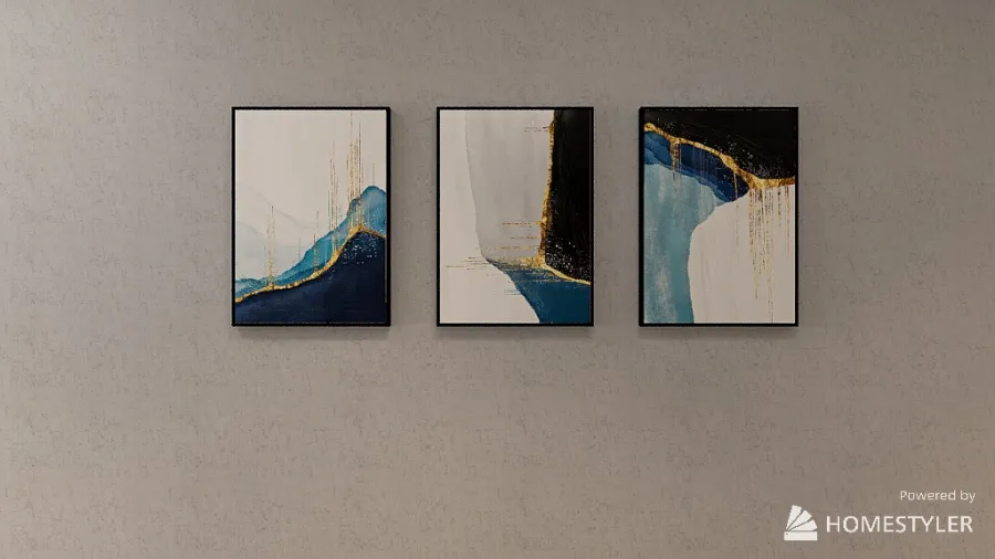
This area of the room is my favourite because of how prepossessing it looks. The beautiful paintings complement the colour of the wall. Not only that, it just looks aesthetic. The green paintings, the green walls, and the modern furniture just completes the look.
720°
Panorama view. I'm sorry that it's blurry.
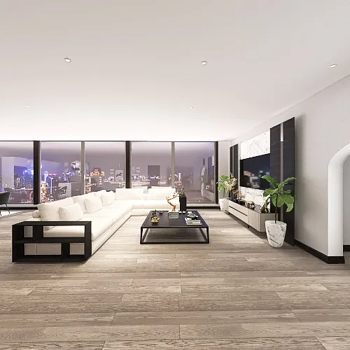
Living Room & Kitchen
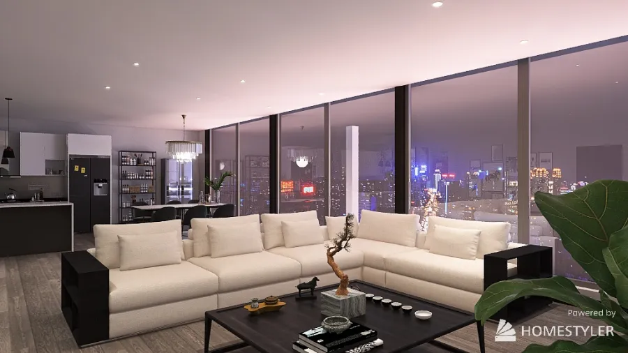
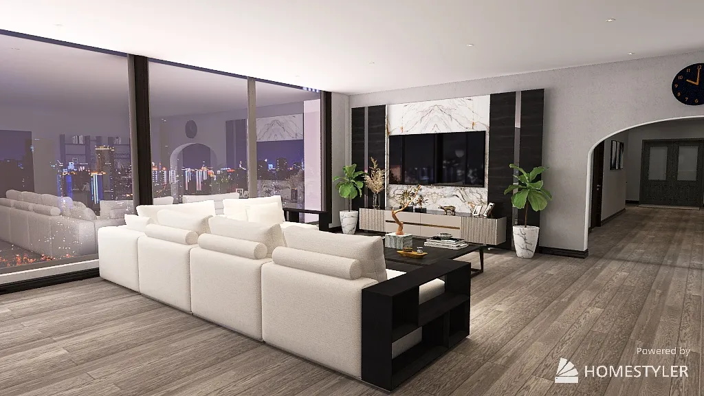
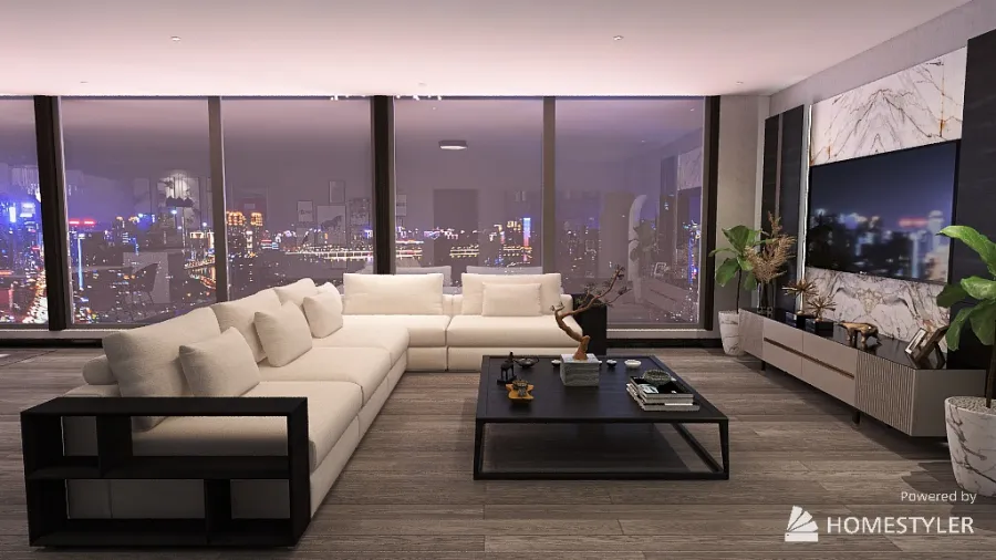
This is a view of the coffee table and couches which a beautiful night scenery in the background that I love.
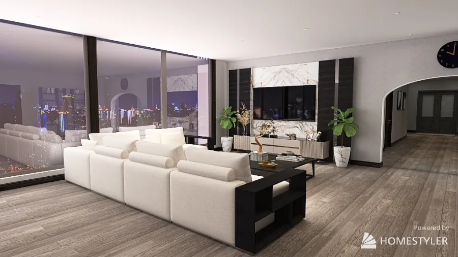
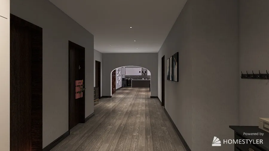
This is how the back of the living room is with a sneak peek of the entrance hallway area.
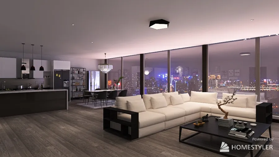
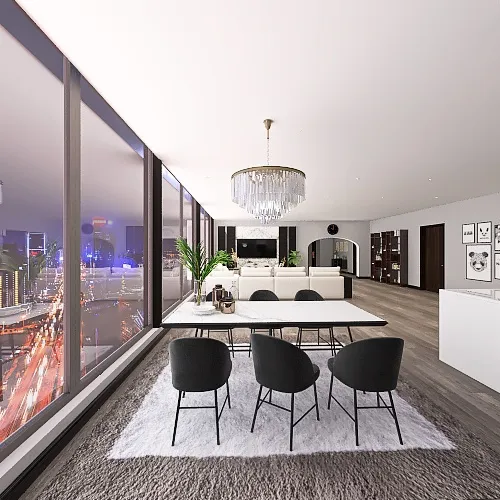
This is another view of the living room and kitchen which are open concepts.
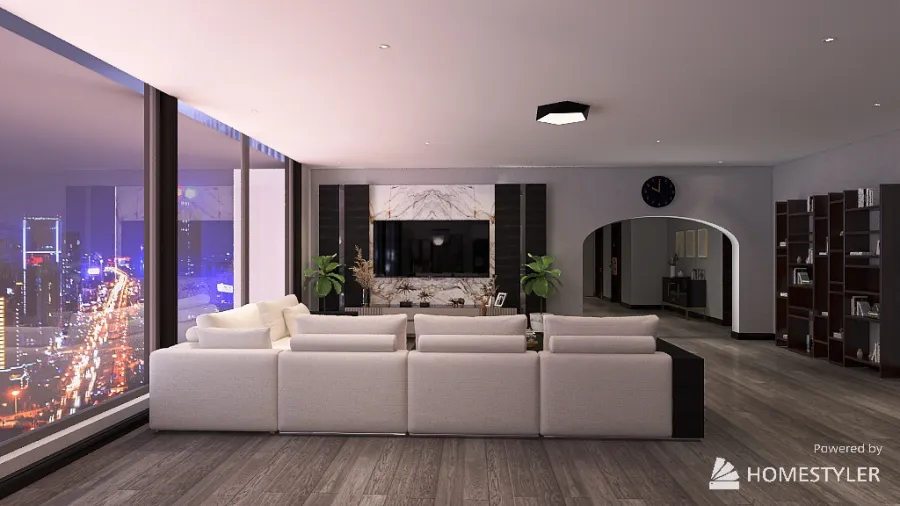
This is a side view of the living room. I love how this looks because there aren't too many distractions and the design elements shine. Additionally, the tv area just makes it look appealing and not plain. Since the couches are white, I feel that the coffee table and tv area are perfect for this.
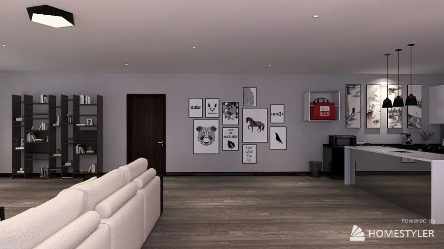
This is the living room. This is also an open concept. I chose for the couches and tv to be on the window side because that's how my home is. Also, it matched the layout of the entire thing itself. Not only that, you get a beautiful scenery too.
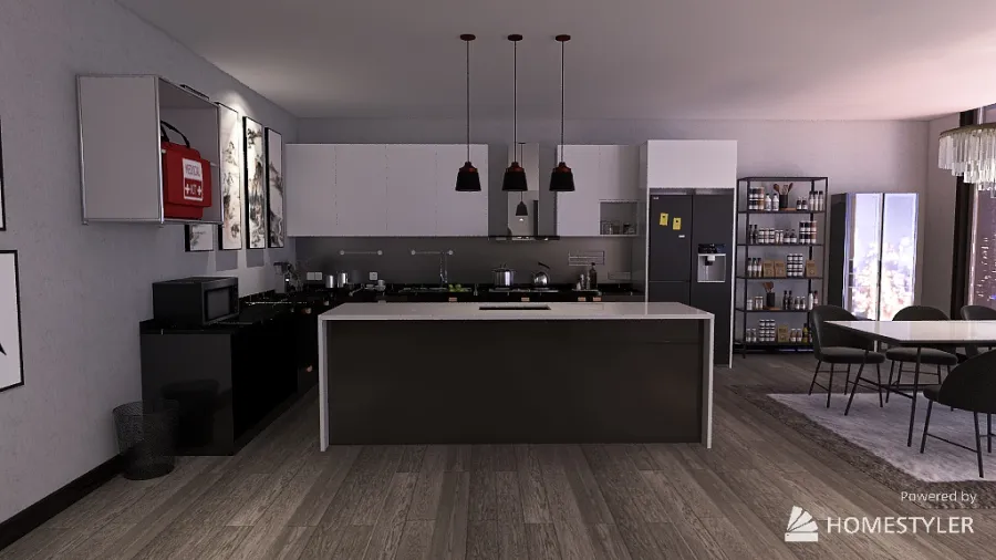
This is the kitchen. It's also an open concept because that was the point of the project. I made sure that it was black and white. I added the island and changed the colour of it. Also, I added more accessories like the shelves at the back, the medical kit, and the microwave.
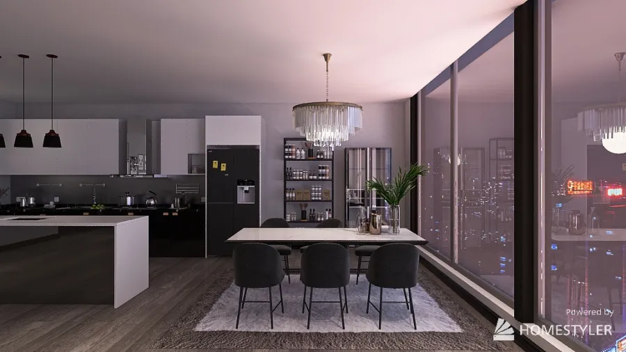
This is the dining table. I kept this as an open concept instead of having a separate area for the dining table because it looked better this way and because I wanted it next to the window so that when you eat, you get a beautiful scenery to admire.
This is the video of the wall. I took this rendered image because I wanted to show the shelf and the paintings, including the medical kit.
720°
Panorama view of the living room. I'm sorry that it's blurry.
720°
Panorama view of the living room. I'm sorry that it's blurry.
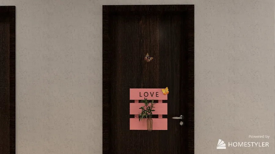
"Entrance"
This is a painting on the wall of where Bedroom 1 is.
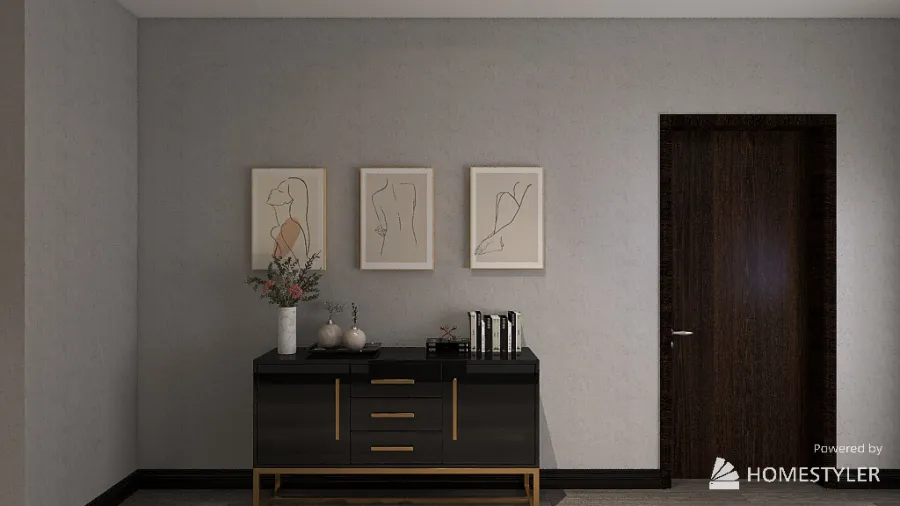
I decided to add a table and paintings above it. I felt that I should add this because lots of houses these days have a table and paintings somewhere in their house. Also, I wanted to incorporate the modern "expensive" look here so I thought that this would be a great idea to add it here.
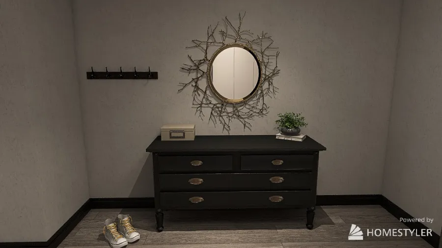
This is near the door. I kept it here because households have these here too. Not only that, I added a mirror, a hook rod to add jackets or sweaters, and a pair of shoes to make the home look more natural. I love the design of the mirror so much.
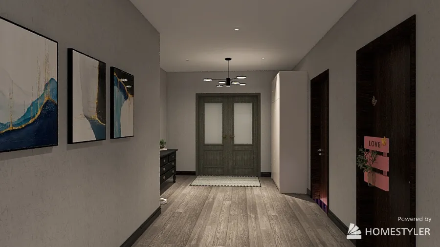
This is the view that you'll see when you are facing the entrance door. I love the layout of this area because it looks organized and not too messy and clustering.
This is the view you'd see as soon as you enter.
This is the laundry room door.
Bedroom 1
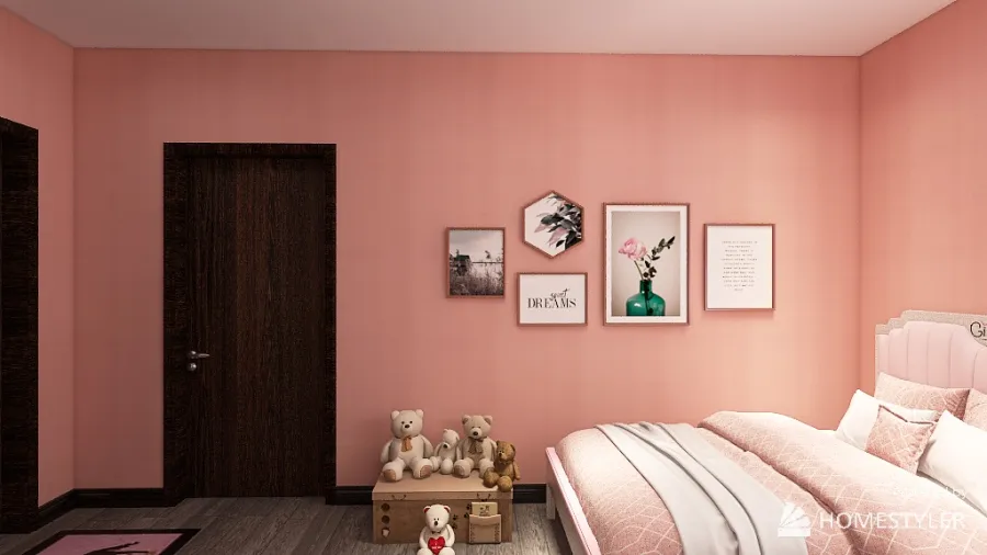
I wanted to keep this side of the bedroom a little simple by adding a toy box and a collage of paintings/picture. I felt that since there was the bathroom door on this side, I should keep it simple as minimize the designs.
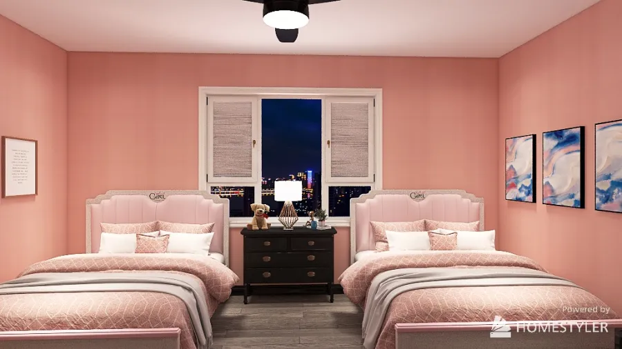
I wanted the bed area to look symmetrical. I added a nightstand in the middle of the two beds. I love how there isn't much going in this area and it looks peaceful. Not only that, the pink colour beds match the colour of the walls. This is a girls bedroom BUT it can be for any gender.
The idea behind this image was to put the mirror and dresser on the wall side and have a beautiful pic-collage and shelf. I decided to add a violin because I play one. My favourite part of this picture is everything. I just love the design layout and how appealing and aesthetic it is.
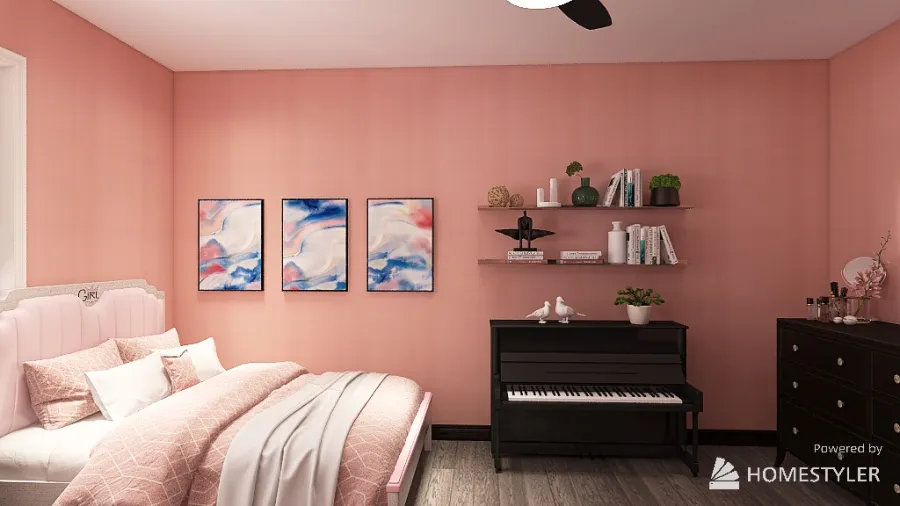
On this side of the bedroom, I decided to add a shelf under the piano as that's how it is in my house. Also, I added the three paintings because the wall looked empty and the paintings just fitted the theme of this bedroom which was modern
720°
Panorama view. I'm sorry that it's blurry.
Laundry Room
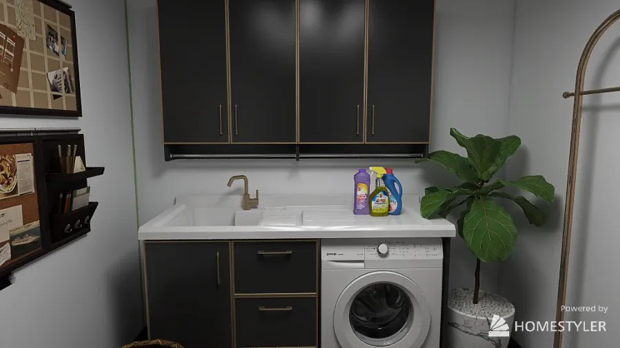
My laundry room is just like any laundry room. It has the cupboards, washing machines, plants, a basket, and a laundry detergent area. I changed the colour of the cupboards to black because the previous colour didn't match the theme of the home.
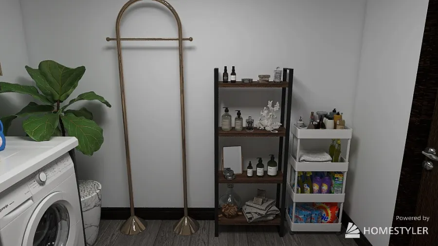
This is another view of the laundry room with the shelf and the laundry detergent area.
This home design project - Dream Home was published on 2023-12-13 and was 100% designed by Homestyler floor planner, which includes 40 high quality photorealistic rendered images.
1
0
325
Updated:2023-12-13
Location: Canada


Comments