
| Palette | Main body | Trim | Accent or best use |
|---|---|---|---|
| 1. Soft white and charcoal | Warm white | Deep charcoal | Natural wood door |
| 2. Cream and bronze | Creamy ivory | Dark bronze | Blackened metal details |
| 3. Greige and white | Light greige | Clean, soft white | Walnut or oak door |
| 4. Putty and black | Muted putty | Near-black | Minimal modern forms |
| 5. Sage and cream | Dusty sage | Warm cream | A restrained, nature-led look |
| 6. Olive and limestone | Muted olive | Pale stone | Works well with warm masonry |
| 7. Blue-gray and white | Soft blue-gray | White | Coastal or contemporary homes |
| 8. Slate blue and charcoal | Slate blue | Charcoal | Stronger contrast without bright color |
| 9. Deep navy and ivory | Inky navy | Ivory | Use where the facade gets good light |
| 10. Charcoal and cedar | Charcoal | Warm gray | Let wood provide the warmth |
| 11. Taupe and black | Mushroom taupe | Black | A grounded, urban palette |
| 12. Sand and bronze | Pale sand | Bronze | Complements warm stone and tile |
| 13. Terracotta and cream | Muted clay | Cream | A warm accent for simple forms |
| 14. Brick red and charcoal | Deep red | Charcoal | Keep trim simple around brick |
| 15. Yellow ochre and white | Soft ochre | Warm white | Best as a measured, sunny statement |
| 16. White and natural stone | Soft white | Stone or greige | Let the masonry carry visual texture |
| 17. Gray-green and black | Gray-green | Soft black | A crisp, contemporary contrast |
| 18. Monochrome gray | Mid-tone gray | Lighter gray | Vary sheen and texture for depth |
Modern house paint colors are less about chasing a single trend than choosing a restrained palette that suits the architecture, light, and materials around your home. Warm whites, muted greens, deep charcoals, and softened blues can all look contemporary when their undertones and proportions work together. The ideas below pair colors by role—main body, trim, and accent—so you can adapt them to siding, masonry, or stucco rather than copy a scheme blindly.

Start with the house, not the paint chip
Before comparing colors, note what will remain unchanged: roof, stone, brick, paving, and neighboring homes. These fixed elements have undertones too. A roof with reddish-brown shingles may make a cool gray body look unexpectedly blue; orange-toned brick can clash with a stark, icy white. Choose paint that relates to those materials instead of competing with them.
Orientation and shade matter. North-facing walls often read cooler, while strong afternoon sun can wash out pale colors and intensify saturated ones. Trees, nearby buildings, and the amount of glass also change how a color appears. I usually begin with the largest fixed surface—the roof or masonry—then select a body color and only afterward settle on trim and accents.
A useful palette has a clear hierarchy: one dominant body color, one supporting trim color, and a limited accent. That does not mean every house needs three different paints. A monochromatic exterior can use one color in different finishes, while a brick home may need only a trim and door color.
18 modern house paint colors: exterior combinations
Use these combinations as starting points. The named colors describe a direction, not a universal paint formula; compare real samples from the manufacturer you plan to use.
1. Soft white, charcoal, and cedar
A warm white body keeps the facade bright without the blue cast of some brilliant whites. Charcoal window frames and fascia define the geometry, while a cedar door or soffit adds a natural counterpoint. This combination suits clean-lined homes, but it can also refresh a simple ranch exterior when the trim is kept narrow.
2. Cream, bronze, and dark metal
Creamy ivory feels softer than pure white beside bronze gutters, dark windows, or warm stone. It is a useful choice when the house has several warm materials that would make a cool white look disconnected. Keep the accent metal consistent where possible; mixing too many competing dark finishes can make a restrained palette feel busy.
3. Greige with soft white trim
Greige sits between gray and beige, so it can bridge a cool roof and warm brick or paving. Test it in both sun and shade: some samples lean violet or green in particular light. Soft white trim gives the facade definition without the sharp contrast of a bright, cool white.
4. Putty with near-black details
A muted putty body paired with near-black windows creates a modern outline while avoiding the starkness of black-and-white. It works especially well on simple volumes with large windows. If the house is heavily shaded, choose a lighter putty so the walls do not disappear into the landscape.
5. Dusty sage and warm cream
Muted sage connects a home to its planting without turning the exterior into a vivid green statement. Warm cream trim keeps the pairing gentle. I recommend sampling sage beside the actual landscaping: foliage can make a green paint look grayer, brighter, or more yellow than it did on a small chip.


6. Olive and limestone
A subdued olive body can sit comfortably beside limestone, pale concrete, or warm-toned roof tiles. Use a light stone color on trim rather than a stark white, especially if the masonry has cream or tan undertones. This palette is strongest when the olive is gray-based and the surrounding materials remain visible.
7. Blue-gray and white
Soft blue-gray gives a home a cool, calm character without the intensity of saturated blue. White trim sharpens the edges, while a wood door can prevent the scheme from feeling cold. On a shaded facade, avoid samples that are already very dark; they may read almost slate after the sun moves away.
8. Slate blue and charcoal
Slate blue paired with charcoal is a deeper alternative to the familiar blue-and-white exterior. It suits contemporary forms and can make pale stone or concrete details stand out. Keep the blue muted and use charcoal selectively on frames, fascia, or a garage door rather than coating every secondary surface.
9. Navy and ivory
Deep navy creates a confident exterior, while ivory trim softens its edges. This pairing is most successful when the facade has enough daylight and the architecture has clear lines. Dark colors absorb more solar energy than light colors, so check the paint maker’s guidance for the substrate and climate before using a very dark shade across broad siding areas.
10. Charcoal with cedar
Charcoal siding and warm cedar create contrast through both color and material. The wood can appear on a front door, porch ceiling, or a small cladding section; it does not need to cover the whole facade. Confirm that the wood species and finish are suitable for exterior exposure and plan for maintenance as it weathers.
11. Taupe and black
Mushroom taupe offers more warmth than a conventional gray, while black trim gives windows and rooflines a crisp edge. This is a flexible option for homes with brown or gray roofs. If the roof is already very dark, use black sparingly so the upper and lower parts of the house do not merge visually.
12. Sand and bronze
Pale sand works with warm stone, clay tile, and sunlit landscapes. Bronze trim or metal details add definition without the hard contrast of black. In bright climates, test the color at midday; a pale sample can look much lighter on a full wall than it does in a store.
13. Muted terracotta and cream
A softened clay tone brings warmth and individuality to a simple facade. Pair it with cream rather than brilliant white, and keep the accent color limited to a door or small architectural detail. Strong terracotta can dominate a large wall, so sample a lighter or grayer version before committing.
14. Brick red with charcoal trim
For painted siding, a deep brick red can feel grounded when balanced with charcoal and a restrained trim color. For existing exposed brick, do not assume paint is the best solution: masonry is a distinct material, and coating it can change its appearance and future maintenance needs. Coordinate trim with the brick’s actual undertone rather than a generic red swatch.
15. Soft ochre and warm white
A muted ochre adds a sunny note without the high intensity of lemon yellow. Warm white trim keeps the color from looking harsh. Use it on a facade that can carry a noticeable hue, and check local rules or neighborhood guidelines before choosing a distinctive exterior color.
16. Soft white with natural stone
When stone already supplies texture and variation, a quiet white body can let it remain the focal point. Choose a white that relates to the stone’s lightest tones, not necessarily the brightest white available. A small sample placed directly beside the masonry is more useful than comparing two chips across a room.
17. Gray-green and soft black
Gray-green combines the calm of gray with a subtle natural cast. Soft black trim provides contrast without looking as severe as a pure black. This palette can work on both modern and traditional forms; the key is to keep the green muted enough that it does not fight the roof or surrounding trees.
18. Layered monochrome gray
A monochrome scheme can still have depth. Use a mid-tone gray on the main body, a lighter gray on trim, and a darker shade on selected doors or metalwork. Texture and sheen help distinguish surfaces, but avoid relying on tiny differences between colors that disappear from the street.
Match the palette to the exterior material
Siding
Siding creates broad, repeated surfaces, so color variation can become more noticeable across the whole elevation. Look at samples on the actual siding profile: grooves and shadows affect how light or dark a color appears. If the siding is vinyl or another manufactured material, verify that the coating is compatible and that the chosen color is approved for that substrate.
Brick and stone
Brick and stone already contain multiple colors. Pull a paint undertone from the material—warm cream from buff brick, for example, or a soft gray from cool stone—rather than trying to match one isolated fleck. If you are considering painting masonry, research the material and coating system first; a paint choice is not always reversible without substantial work.
Stucco
Stucco’s texture creates small shadows that can make a color look deeper than it does on a flat sample. A pale neutral often reads more varied on a textured wall, while a very dark color can emphasize surface irregularities. Test a large patch on more than one side of the house before ordering the full quantity.
Trim, doors, and rooflines
Trim should clarify the architecture, not outline every feature automatically. On a house with many windows and corners, matching trim to the body can reduce visual clutter. A front door is a lower-risk place for a stronger accent, provided it relates to the roof, landscaping, or other fixed materials.
How to test modern house paint colors before buying
A paint chip is a starting point, not a reliable preview of an entire facade. I’ve seen a color that looked neutral indoors turn noticeably green outdoors, and the reverse can happen when a sample is viewed in deep shade. Use a deliberate test rather than choosing from a phone screen or a tiny card.
- Shortlist a few related colors. Compare undertones, not just lightness. A warm gray and a cool gray can behave like different colors beside brick or wood.
- Apply large sample patches. Follow the paint manufacturer’s directions and use the intended primer or sample system where appropriate. Place samples on different elevations, not only beside the front door.
- Observe them at several times. Check morning, midday, and late afternoon, and look again on a cloudy day. Note how the color changes in direct sun and shade.
- View the samples from the street. Exterior colors are read at a distance. A subtle difference on a small board may vanish across the facade, while a saturated color may feel stronger than expected.
- Check the complete combination. Put body, trim, and accent samples beside the roof, brick, stone, and paving. A palette should work as a group, not as three isolated favorites.
- Confirm product and local requirements. Review the coating’s suitability for the surface, climate, and exposure. Check any homeowners’ association, historic-district, or municipal requirements before painting.
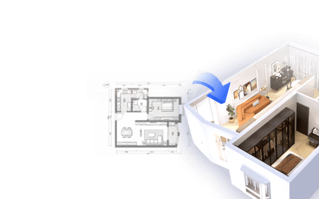
For a visual planning step, you can build a 3D exterior concept in Homestyler and compare broad color relationships before purchasing paint. A rendering helps with composition, but it cannot reproduce the exact finish, texture, or changing daylight of a real wall; physical samples still matter.
Common exterior color mistakes to avoid
- Choosing from a screen alone. Displays vary, and digital previews cannot show the real surface texture or finish.
- Ignoring fixed materials. Roofs, brick, stone, and paving remain part of the palette even when they are not being painted.
- Using too many accents. Several unrelated trim and door colors can fragment a simple facade.
- Assuming white is neutral. Whites have undertones; compare them beside the materials they will touch.
- Painting every feature for contrast. Matching trim to the body can make a busy facade feel calmer.
- Skipping a large test. A small chip cannot show how a color behaves across a full wall in changing light.
- Overlooking product compatibility. Exterior coatings must suit the substrate and exposure; follow the manufacturer’s preparation and application instructions.
Frequently asked questions
What are the most popular modern house paint colors?
Warm whites, greiges, muted greens, blue-grays, charcoal, and earthy taupes are common contemporary directions. Popularity alone is not a reason to choose one: the best option relates to the roof, masonry, light, and architecture of the specific home.
Which exterior colors make a house look modern?
A limited palette with clear roles often feels more modern than a particular hue. Try a restrained body color, coordinated trim, and one purposeful accent. Simple contrast, consistent finishes, and attention to existing materials usually matter more than choosing the newest trend color.
Should exterior trim be lighter or darker than the house?
Either can work. Lighter trim can emphasize edges and openings; darker trim can frame windows and simplify a facade. If the house has many architectural details, trim close to the body color may look more cohesive. Test the full combination at a distance before deciding.
Is dark exterior paint a good idea?
Dark paint can create a strong, contemporary look, but it absorbs more solar energy than lighter paint and may be subject to product or substrate limitations. Check the manufacturer’s recommendations for the surface and local conditions, and test the color in full sun and shade.
How many colors should an exterior palette use?
Many homes work well with two or three coordinated colors, but that is a guide rather than a rule. Existing brick, stone, roofing, and natural wood already add colors. Count those materials as part of the overall composition before adding more paint shades.
Can I use the same color on siding and trim?
Yes. A single-color exterior can look intentional and contemporary, especially when the architecture is simple. Differences in sheen, texture, or shadow can provide definition without introducing another color. Confirm that the selected finish is appropriate for each surface.
Choose a palette that belongs to the house
The strongest modern house paint colors are not necessarily the boldest or newest. They make sense beside the roof, masonry, landscape, and light, and they give the facade a clear visual hierarchy. Start with fixed materials, shortlist a few related palettes, and test large samples on multiple sides of the home before making a final choice.
If you want to compare body, trim, and door colors in context, sketch an exterior palette in Homestyler before buying samples. You can also explore exterior design ideas in Homestyler to organize options, then rely on real paint samples and product guidance for the final decision.
Originally incubated at Autodesk, Homestyler has grown into one of the most widely adopted home design platforms in the world, now trusted by over 20+ million registered users (platform data, 2026). Whether you're a homeowner exploring ideas or a professional designer delivering client-ready renders, Homestyler brings industry-leading 3D technology to your fingertips — no experience required.