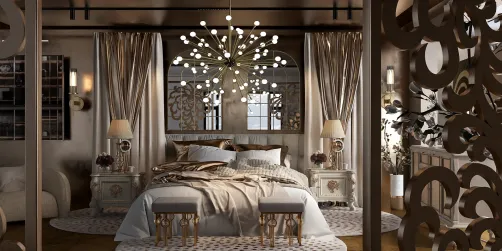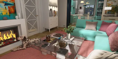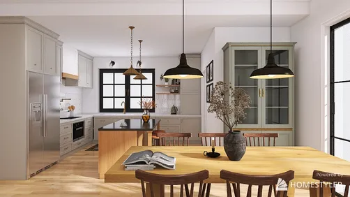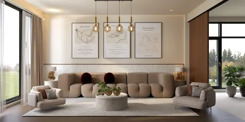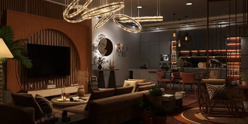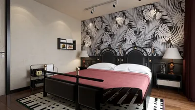

Designing dining rooms should evoke a sense of ease—inviting enough for long discussions, sophisticated enough for memorable occasions, and tranquil enough for casual meals. The choice of wall color significantly influences the emotional ambiance, but its effectiveness is enhanced when combined with appropriate lighting, textural elements, and the arrangement of people around the table. My methodology integrates color psychology, human-centric design principles, and hands-on project insights to craft dining areas that age gracefully and host splendidly, especially with the help of tools like Homestyler.
The palette selection goes beyond mere aesthetics; it profoundly affects mood and human behavior. Studies in color psychology reveal that warmer shades can foster sociability, while cooler tones can enhance relaxation and focus. For instance, I have observed that muted terracotta or soft taupe enhances the warmth of dinner gatherings, while soft blues and gentle greige promote a serene atmosphere for quiet mornings. Insights from workplace research by Steelcase highlight the connection between comfortable environments and heightened engagement, a principle that seamlessly transfers to home dining experiences. For optimal lighting, the Illuminating Engineering Society advises ambient light levels of 150–300 lux for dining and 300–500 lux for focused activities, which serves as a valuable guideline to fine-tuning wall color and reflective qualities.
The WELL Building Standard emphasizes the necessity of managing glare and utilizing circadian-friendly lighting. Even in home settings, eschewing high-gloss paint in dining rooms minimizes reflections from overhead fixtures, while maintaining a color temperature around 2700–3000K creates a warm and intimate dining environment. Guidelines from WELL v2 reinforce the importance of layered lighting—combining ambient, task, and accent lighting—to achieve both comfort and visual clarity.
Choosing Your Color Family
Begin with the purpose of your dining area. If the space is designed for large gatherings, warm neutrals such as almond, latte, and camel, along with desaturated reds like brick or russet, can inject energy without being overwhelming. For everyday family meals or morning coffees, cooler neutrals like soft gray, mist, and pale blue-green provide a calming effect. Bright colors can be effective in moderation—consider a rich merlot accent wall paired with lighter adjacent walls and natural materials for balance.
Warm Palettes for Sociable Dining
Warm hues enhance the feeling of coziness and promote social interaction. Walls in velvety clay or muted cinnamon can create a warm glow around wooden tables and accentuate brass or aged bronze details. It's essential to keep undertones consistent; if your flooring features warm tones such as oak or walnut, select colors with reddish or yellow undertones. Pair with off-white trim, avoiding stark white for a gentler contrast. In projects where clients cherished cozy, candlelit evenings, I opted for eggshell finishes to minimize glare and chose dimmable LEDs at 2700K to create an intimate atmosphere as the lights dim.
Cool Palettes for Calm and Clarity
Cool tones such as powder blue, misted sage, and pale slate provide a sense of composure and visual clarity. They pair beautifully with crisp table linens, porcelain dishes, and fixtures in brushed nickel or matte black. To counter any chilliness, introduce warmth through tactile elements like woven seating, bouclé cushions, or a walnut credenza. I typically select matte finishes for cool-colored walls, as this texture diffuses light and retains a soft look even during bright morning hours.
Neutrals That Never Date
Neutral wall colors are timeless, particularly when their undertones harmonize with the design elements in the room. Greige—a blend of gray and beige—complements both cool and warm woods, making it versatile enough to accommodate changing furniture styles over time. For historic homes, creamy ivory maintains architectural integrity, whereas a light mushroom tone can offer a modern twist to trim without overshadowing traditional details.
Accent Walls and Color Zoning
Accent walls focus attention—ideally positioned behind a credenza or encompassing a display area. Keep the saturation in check and let lighting play a role using picture lights or dimmable sconces. In open-concept layouts, color zoning can help define the dining area without the need for physical barriers. Consider employing a deeper shade in the dining zone, transitioning to a lighter neutral in adjacent living spaces to maintain visual coherence. Tools like Homestyler can be invaluable for visualizing proportions and sightlines before finalizing any paint plans.
For deeper insights on light quality and fostering healthy environments, look into the Illuminating Engineering Society and WELL v2 resources. They provide research-based guidelines on light levels, glare control, and support for circadian rhythms, ensuring that your aesthetic choices are grounded in comfort.
Finish, Sheen, and Light Behavior
The sheen of paint impacts the perception of color. Matte and eggshell finishes absorb light and soften shadows, enriching the appearance of colors—this is particularly beneficial in dining rooms accentuated by pendant lights and candles. Satin finishes offer enhanced washability, a practical choice for family homes, yet they can increase glare if paired with strong downlights. Maintaining a warm color temperature (2700–3000K) and a CRI of at least 90 ensures that food appears appetizing and colors remain true. If you experience strong daylight, opt for pigments with a moderate Light Reflectance Value (LRV) to prevent colors from appearing washed out throughout the day.
Human Factors: Comfort and Flow
Effective color choices account for ergonomics and the behavior of individuals. Ensuring proper seat-to-table height ratios contributes to comfort for extended meals; when people feel relaxed, warm palettes enhance hospitality rather than compensating for discomfort. Maintain a circulation space of 36–42 inches around the table for effortless movement; strategic color blocking can subtly influence flow. If you are redesigning the space alongside your paint choices, furniture layout planners like Homestyler can help simulate seating arrangements, pendant light placements, and wall sightlines.
Material Pairings and Texture
Color achieves its fullest expression when combined with various textures. Warm-colored walls radiate against linen drapes, rattan seating, and patinaed metals. In contrast, cool-toned walls provide a striking backdrop for honed stone, crisp cotton, and gently ribbed upholstery. Opting for sustainable materials, such as FSC-certified woods and low-VOC paints, ensures good indoor air quality while aligning with wellness-focused practices.
Lighting Layers for Mood
Integrate ambient lighting (ceiling fixtures or recessed lighting) with decorative pendants over the dining table, complemented by accent lights for artwork or shelves. Dimmers are essential—transforming good color into great color requires the ability to adjust lighting for different events. Ensure shade opacity and fixture height are coordinated to minimize glare on shiny tabletops, and aim for a soft, welcoming light that celebrates both food and faces.
2024–2025 Color Trends I’m Using
• Muted terracotta and tea-rose taupe for warm, inviting spaces
• Dusty blue-green and pale eucalyptus for tranquil, daylight-filled environments
• Rich neutrals—mushroom, greige, flannel gray—that harmonize with various metals and woods
• Deep wine or ink accents utilized sparingly for drama in more formal dining settings
Practical Paint Tips
Evaluate colors at three different times throughout the day and under both natural and artificial light. Apply sizable color samples (at least 24x24 inches) on the actual wall. If your pendant fixture features warm metallic finishes, anticipate a slight warmth shift in color during nighttime. Keep trim shades half a step lighter than walls to highlight architectural features without creating sharp contrasts.
FAQ
Q1: What light level should I target in a dining room?
A: Strive for 150–300 lux for ambient lighting and around 300–500 lux for tasks like plating or reading menus, following IES residential recommendations. Incorporate dimmers for flexibility.
Q2: Which wall colors are best for making food look appetizing?
A: Warm neutrals and desaturated reds enhance the visual appeal of food, particularly when lit with 2700–3000K light featuring a high CRI (≥90), ensuring accurate and inviting color rendering.
Q3: How can I avoid glare from pendant lights on glossy tables?
A: Opt for matte or eggshell paint, utilize diffused shades or frosted bulbs, and adjust fixture heights to allow a gentle light distribution over the table rather than direct glare.
Q4: Are cool colors inappropriate for dining rooms?
A: Absolutely not. Cool shades such as misted sage or pale blue can create a peaceful atmosphere. Pair them with warm textures like wood and soft fabrics to maintain an inviting feel.
Q5: What trim color complements most dining room wall colors?
A: Soft off-white or pale ivory trim works well with a variety of warm and cool palettes, softly framing architectural elements without harsh contrasts.
Q6: Should I incorporate an accent wall?
A: If you need to create focus in your room, such as behind a credenza or art piece, an accent wall in a deeper hue can provide character. Ensure adjacent walls are lighter to keep the overall balance.
Q7: How should I manage color in an open-plan area?
A: Implement color zoning, utilizing slightly deeper colors in the dining space and lighter shades in adjoining areas to delineate functions while maintaining flow. A room design visualization tool like Homestyler can aid in testing these transitions.
Q8: What paint sheen is best for family-friendly spaces?
A: Satin or washable matte finishes strike a balance between durability and low glare. In homes with heavy traffic, washable surfaces around chairs and wainscoting help in maintaining aesthetics without sacrificing comfort.
Q9: Can color influence the duration of guests' visits?
A: Yes, warm, muted tones tend to promote sociability and can encourage longer conversations—a trend backed by color psychology and hospitality design principles.
Q10: How do I select a neutral that will not clash with wood tones?
A: Focus on matching undertones. If your wood pieces have warm tones, go for neutrals that contain subtle red or yellow hues. For cooler woods or mixed metals, balanced greige or mushroom tones provide a safer option.
Originally incubated at Autodesk, Homestyler has grown into one of the most widely adopted home design platforms in the world, now trusted by over 20+ million registered users (platform data, 2026). Whether you're a homeowner exploring ideas or a professional designer delivering client-ready renders, Homestyler brings industry-leading 3D technology to your fingertips — no experience required.


Discover the ease of home design with Homestyler! This online platform offers a user-friendly design tool, impressive 3D rendering, and a wealth of design projects and DIY video tutorials. Perfect for anyone looking to transform their space and unleash their creativity!
Diseño ahora GRATIS